Visualizing mineralization trends with geological software
As the title shows, this time we thought we would go back to the basics a bit for geological software. Recent chats with customers highlighted that it might be useful for some to share our ideas regarding visualization of trends in mineralization. But to make it slightly different we will start by using some knowledge from experts in detecting trends in data: radiologists. Hilco has been lucky enough to work closely together with radiologists in the past and that experience has been a great influence in the way we developed our geological software. The radiologist’s main task is looking at a screen detecting anomalies in their data and classifying those anomalies (sound familiar?). So what do they do that might help you in your work?
First, optimize your work environment
Before you start analyzing mineralization trends in geological software, you would be well off spending a little time creating an environment that will help you improve any visualization. That means creating a somewhat dark environment, without any glaring sunlight hitting your screen. If you look at the workspace for radiologists, they will often work in a dark room without any sunlight. Of course, they generally also have optimized and certified monitors due to the importance of their work, but this is not necessary for geology. Suffice it to say that humans are sensitive to light / colors and it pays off to invest a little time to create a good environment (for me it means I usually have the shutters down when visualizing geological data).
Next, optimize the display: to color or not to color
The next step is adjusting the color information. This is a crucial step to highlight structures in mineralization. Jun Cowan has written an excellent article on this using X-ray mode or maximum intensity projection (MIP) (http://www.orefind.com/docs/default-source/orefind-research-papers-in-pdf/cowan_2014_xray.pdf). It is a great way to detect trends, but not available to everybody. In addition, using pseudo-color images can sometimes result in false contours. This is related to our human perception of color. Picking the right pseudo-color for intensities has been subject to research for many years (just do a google search on pseudo-color or false color images). For an example on how different color spectra will highlight different objects, check this simple image on Wikipedia: https://en.wikipedia.org/wiki/False_color#/media/File:Daedelus_comparison,_remote_sensing_in_precision_farming_(rotated).jpg. Notice how the different images draw your attention to different patches. Especially the middle and right images (the middle image draws attention to bottom-right, middle-left and top-right, whereas the right image draws your attention mainly to the middle-middle two patches). Add to this the fact that 8% of males have some form of color blindness (https://nei.nih.gov/health/color_blindness/facts_about) and you can easily see that the use of colors should be carefully considered and different settings might be needed for different projects or different users.
Beware of false trends
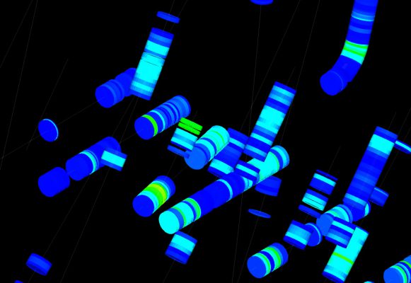
For geochemical data like assays, there is an additional factor involved. If your data is recorded down a hole you will typically have assay data represented as cylinders down a hole and most geological software will allow you to display your drilling data as such:
These days most geological software will also allow you to scale the cylinders with the assay values resulting in discs of various sizes. It produces very pretty images and can quickly highlight high grades.
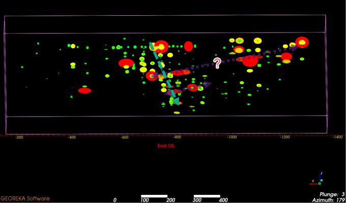
For detecting outliers, that works really well. However, for detecting trends some care must be taken so it will not introduce false trends. This is due to the fact that the discs will always be around the drill traces and hence along the drill trace direction. As a result, the preferred direction of the discs will be perpendicular to those drill traces. However, that does not mean the mineralization will follow the same direction!
As an example, above we show some uranium samples as percentages. They are colored using a default blue to red pseudo-color scale. In addition, the grades are shown down hole as cylinders scaled by the grades. Notice how the colors and disc sizes give a perceived trend from East to West (colors capped to 0.0 – 0.7 for a bit more dramatic effect).
Simple improvements
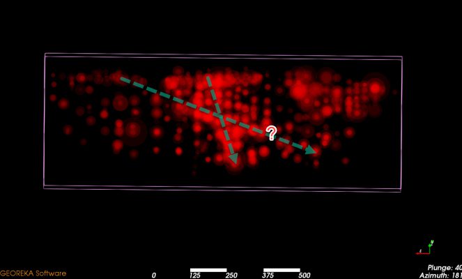
To improve geological software settings for detecting trends begin by choosing to display all values as a single color. Use a single color background (usually black or white) and change the transparency of the data like previous image. These are all settings that are commonly available in any geological software. Now, instead of using discs or cylinders, extract the interval mid-points and display the grade data as points. Play with the size of the points and the transparency setting. Rotate, zoom in / out and change the settings mentioned before until patterns (or lack thereof) start to emerge. In addition, we commonly adjust two more useful options: the dynamic ability to change cut-off ranges and to scale the points by grade value. Both are available in GEOREKA’s geological software. The former allows for detecting trends at various cut-offs to see if they are consistent across grades or not. The latter is like a poor-mans simple interpolation: high grades have a greater radius of influence compared to lower grades. This makes it more likely for spheres to overlap increasing the intensity which again helps to detect trends.
Dynamic visualization
To determine the direction of trends the improvements above all help, but only if data is looked at from various angles. Any geological software will allow you to rotate the data and look at it from all angles. This is typically what Jun Cowan highlighted in his article to show the folded structure. Even when looking at data in 3D, it remains a 2D representation on a screen (unless you use virtual reality, which we’ll talk about in a separate article). To see the correct structural controls, it is necessary to rotate the 3D ‘world’ and view the data from all sides to determine the right orientations and plunge direction. In addition, as we stated, we also adjust the grades thresholds, either looking at the lower grades or just the higher grades as some trends are more pronounced for lower grades, others for higher grades.
Verifying trends
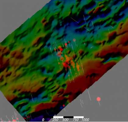
When an image is placed in the 3D geological software it allows us to look at it at low angles. By doing this for the geophysics data we can apply the same anamorphic projection that Jun mentions. However, contrasting to his article we not only do it for the assay data, we apply it to the geophysics images as well. This old technique has proven very valuable for us becoming semi-finalists in the Integra Gold Rush Challenge (2016).
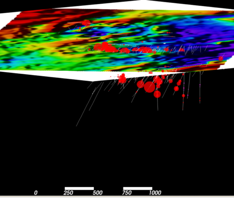
It has also proven valuable in the project below, where it allowed us to define a boundary zone for the project. For this we outlined a major structure on the geophysics image discovered using anamorphic projection during assay sample display.
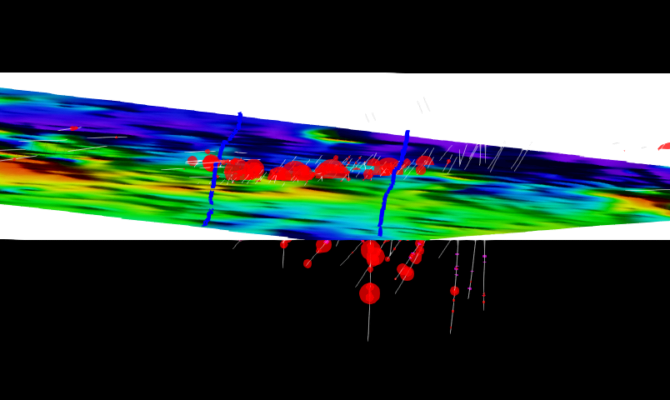
We then combined that with the trend information obtained from the assay data to define a zone of mineralization by extruding the outlines on the geophysics images along the assay trends (proprietary data so we cannot be too specific)
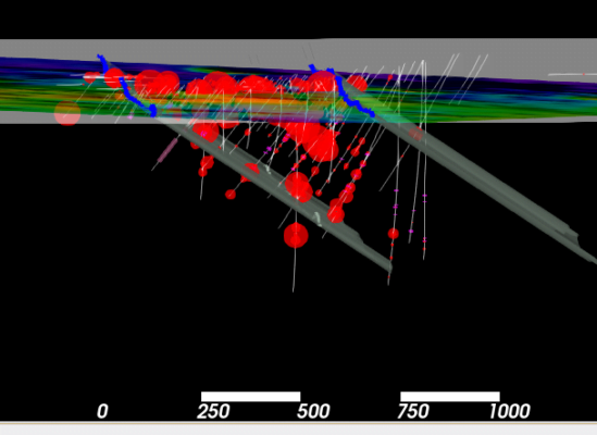
Some final words
Notice how we did not mention anything about geological field work as refernce. This is not because we do not consider it important (on the contrary!). However, our focus (being a software company) is on providing software tools and tips to help with geological modelling for all geosciences including precious metals and industrial minerals.
If you wish to try it out yourself, you can get a 30 day free trial by filling out the form on our website: https://www.georeka.com/pricing-2/
